Autodesk · Strategy & Roadmap
-Defining Shotgrid design strategy
Client /Autodesk
Product /Shotgun
Role /Product Design, User Research
When I joined Shotgun in 2018, the 15 year old production management software had just embarked on an exciting adventure: to redesign itself from the ground up to keep its leadership position on a market swarmed with new competitors and undergoing massive transformations, while expanding its customer base to demonstrate its capacity for growth to its parent company, Autodesk. As I joined, I helped reconcile opposing views in the company and define a clear strategy towards growth.

THE GOAL
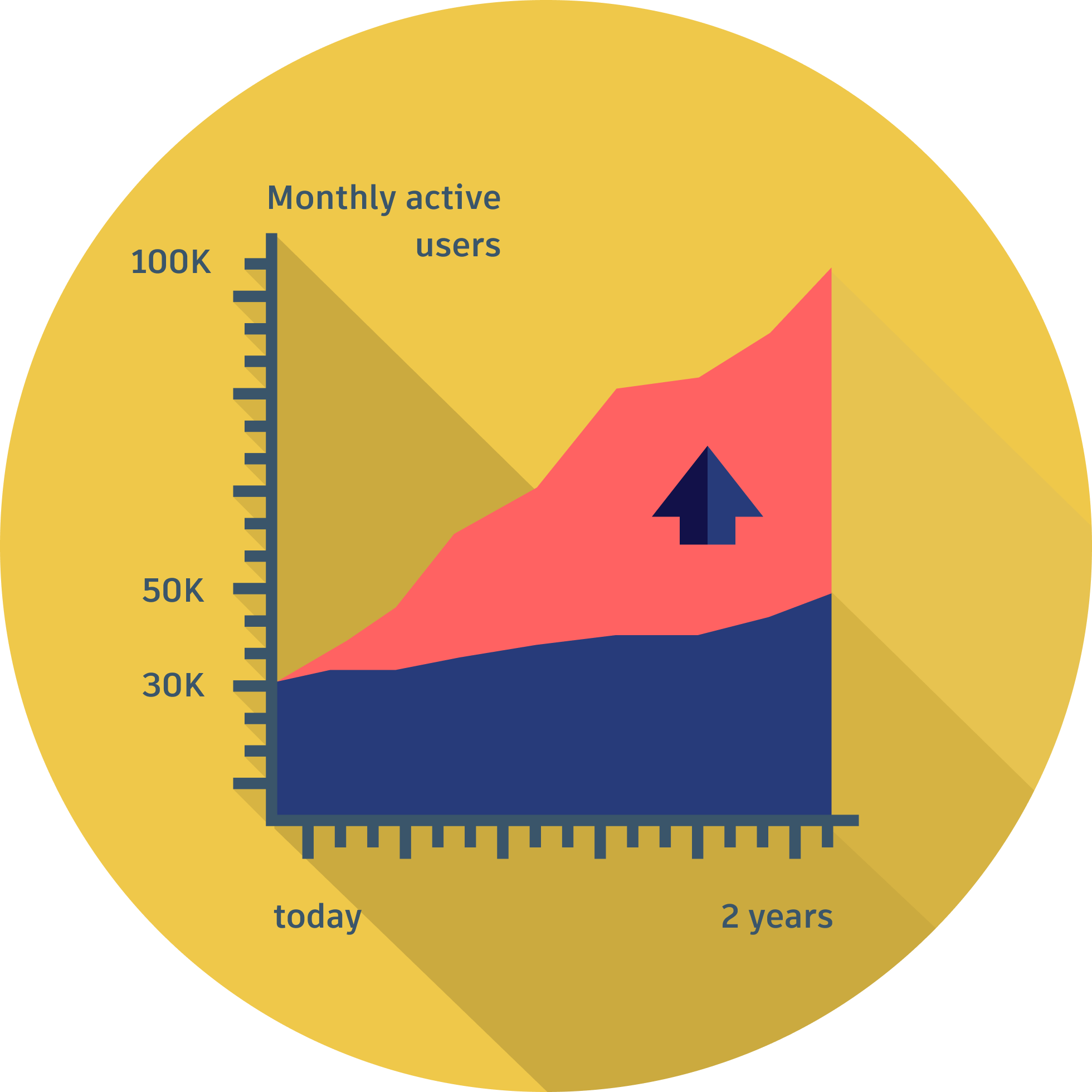
Dramatically grow our user base
Shotgrid is a production management software specialised in supporting media production workflows.
Shotgrid's growth is steady (+16% active users per year), but its new ambitious objectives; to grow from 30k monthly active users to 100k in two years, meant that it needed to dramatically multiply its current growth, bringing an unprecedented amount of new clients to adopt it.
15 years old, Shotgrid is the leader on the Film Industry market.
THE CHALLENGE
An extremely confusing interface
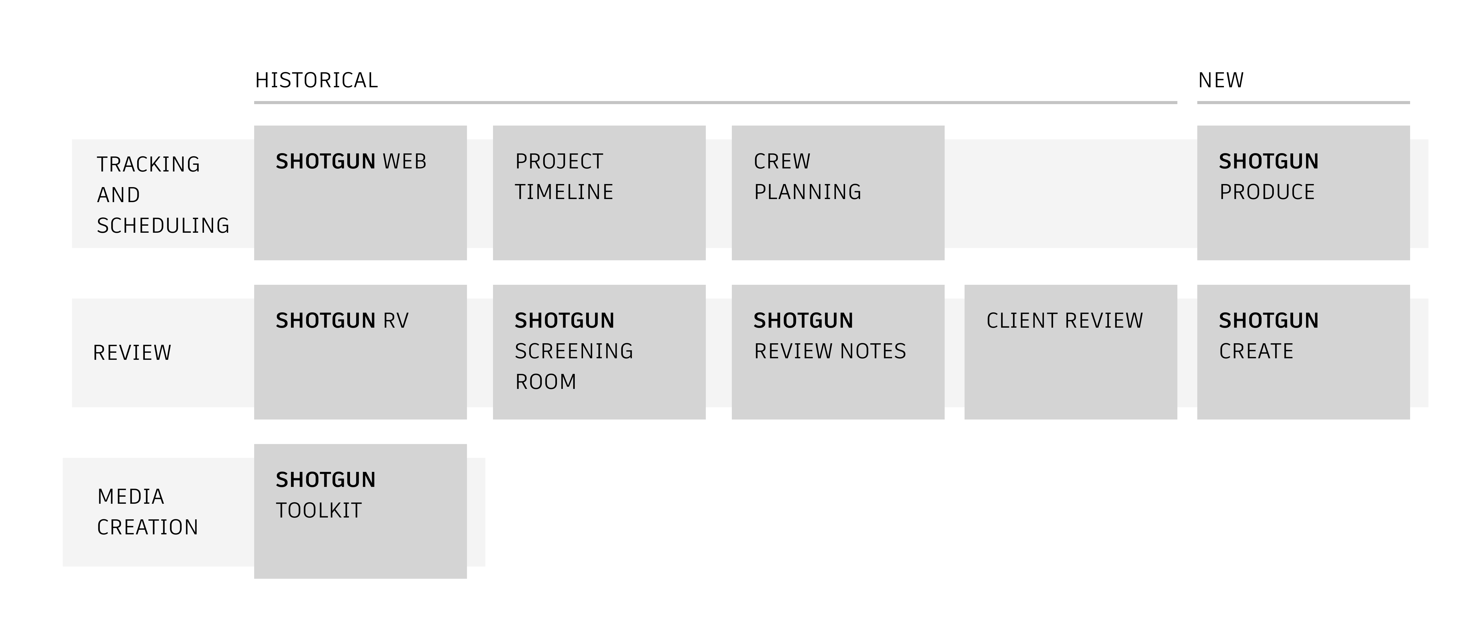
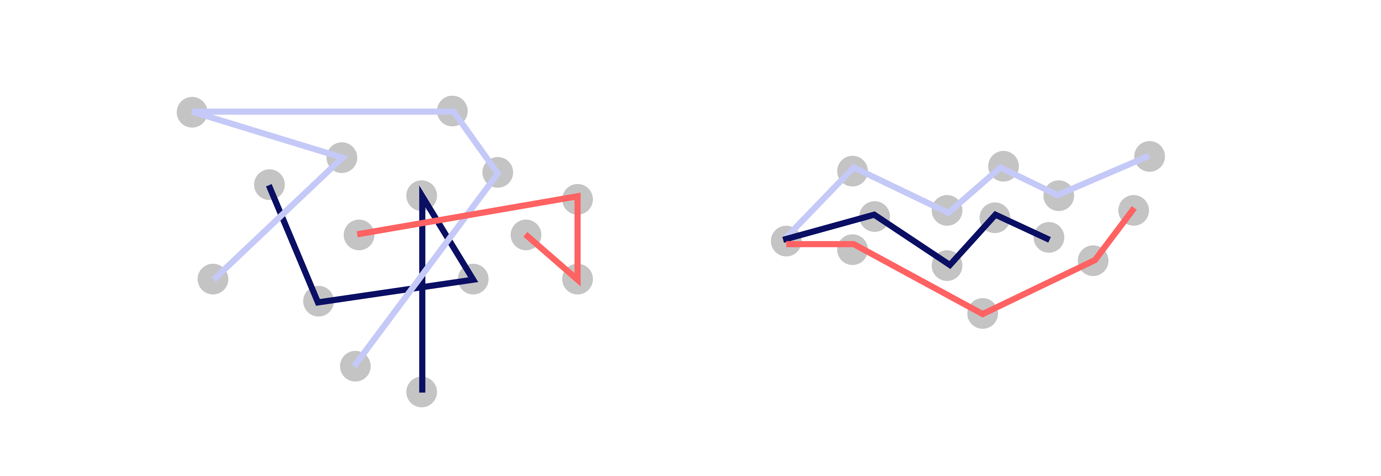
Shotgrid’s interface has been built by engineers over 15 years, bringing together disparate features, unfinished experiments and various design choices. It is broken into 10 different live apps, which features often overlap each other.
Conflicting views in the organisation
As I started working at Shotgun, I quickly realised that two seamingly irreconcilable views were at play in the organisation, while none of those seemed to draw a clear path towards Shotgrid's ambitious two years growth objective.
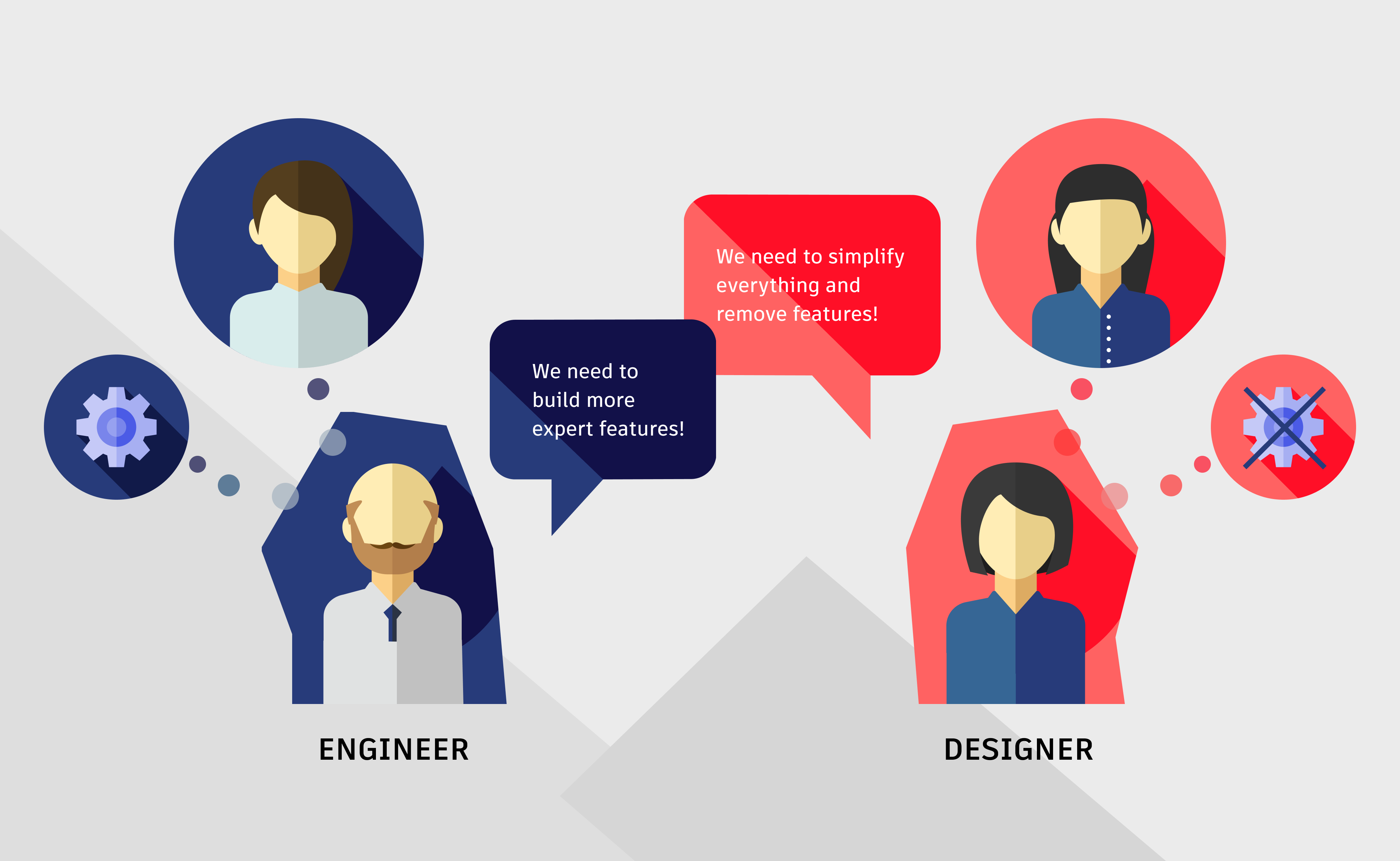
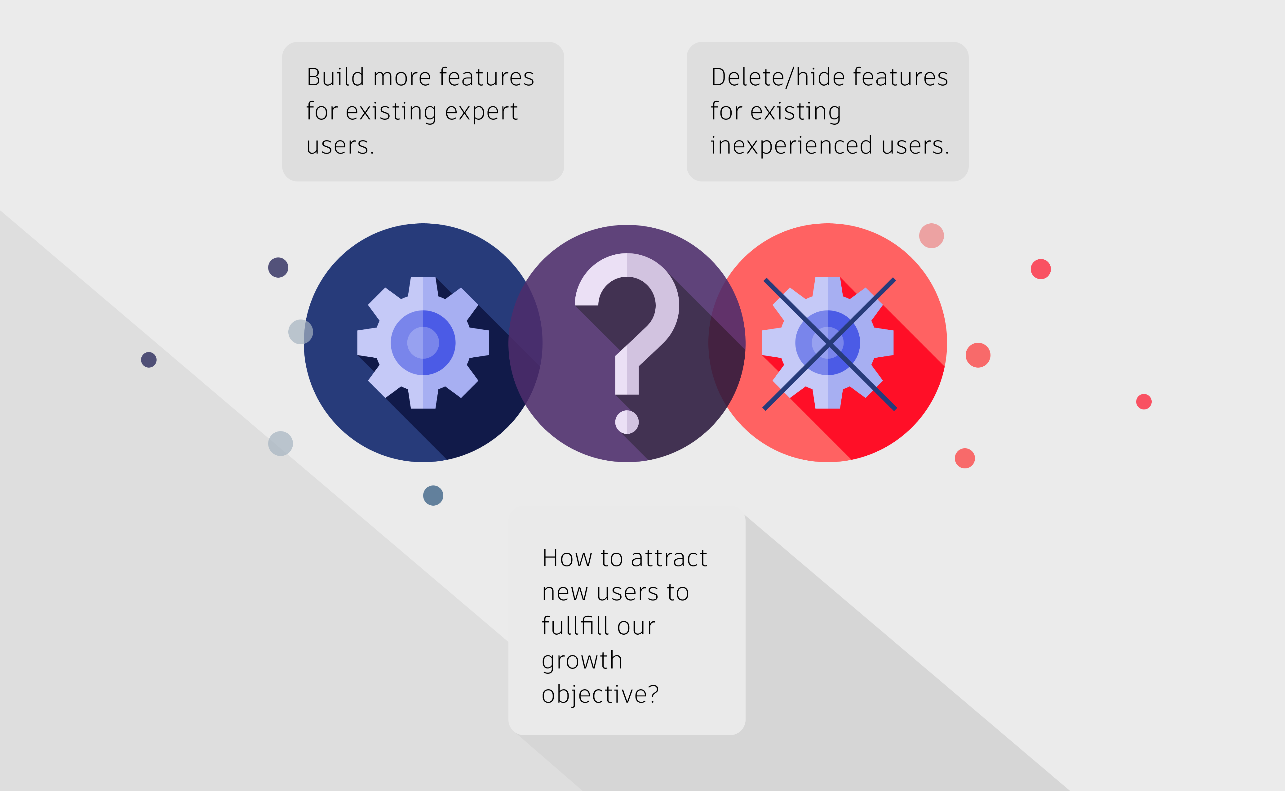
View 1. “We need to build more expert features”.
Built by and for people from the industry, Shotgrid's roadmap had always been driven by clients’ ad hoc requests and designed by default by engineers who added new features without following any design principles or long term vision.
View 2. “We need to simplify everything by hidding complex features and preventing customisation”.
In the year leading to my recruitment, a massive investment in design had been made, bringing for the first time a team of designers to rethink the app entierely, to help users make sense of it. Looking at the myriad of heterogeneous apps that constitutes Shotgrid's software universe and the complexity of the interface, they had decided to rebuild three while drastically simplifying them.
No clear path to growth
THE RESEARCH
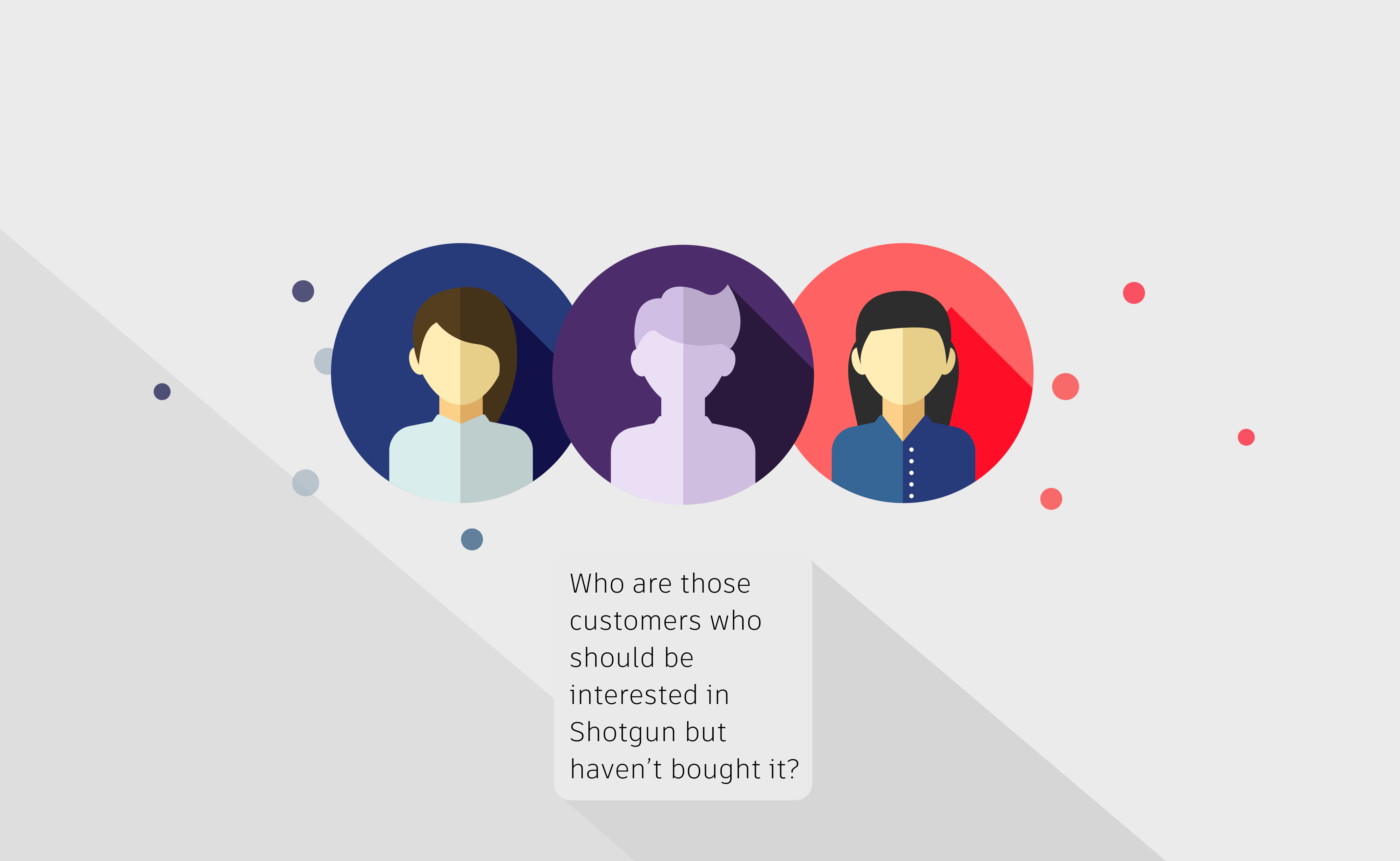
Understand our trial users
Shotgrid's current approach was to design for clients we already had. In order to fulfill our two year growth target, we needed to hear from users who hadn’t bought our app, or had just converted.
Why do customers consider Shotgrid?
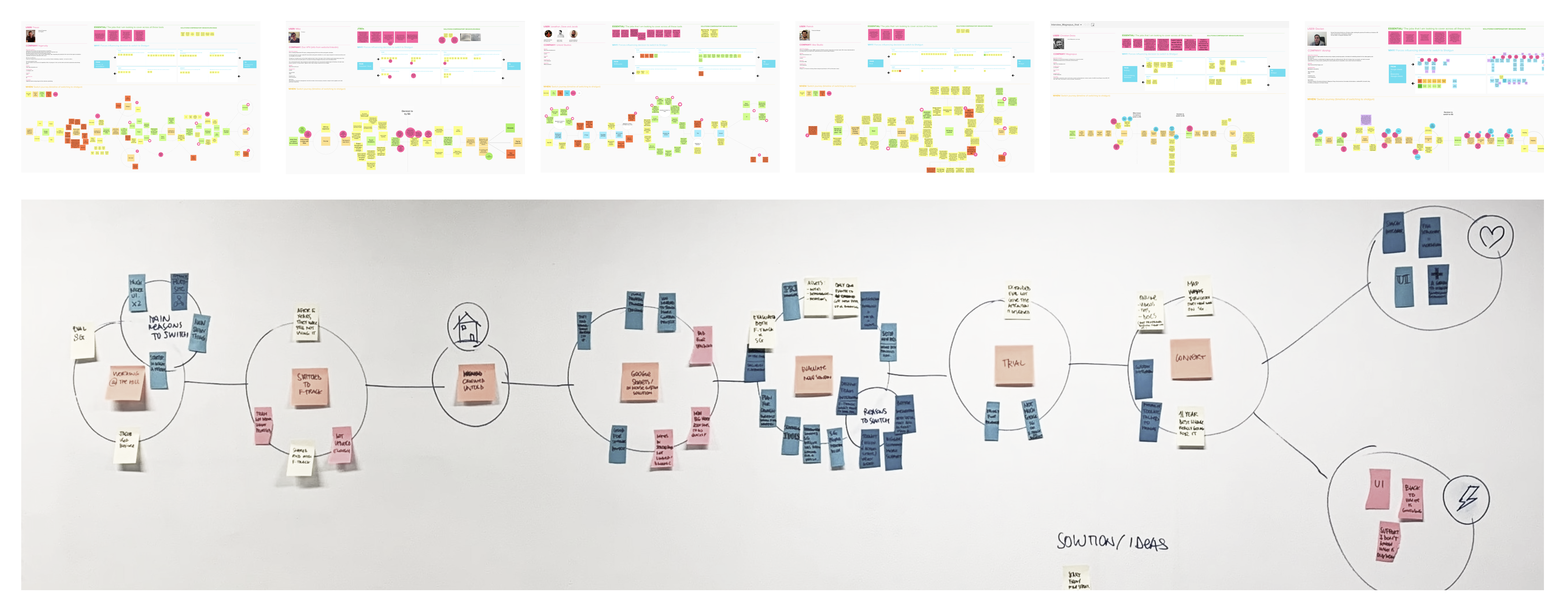
We conducted switch interviews with trial users and looked at the competition.
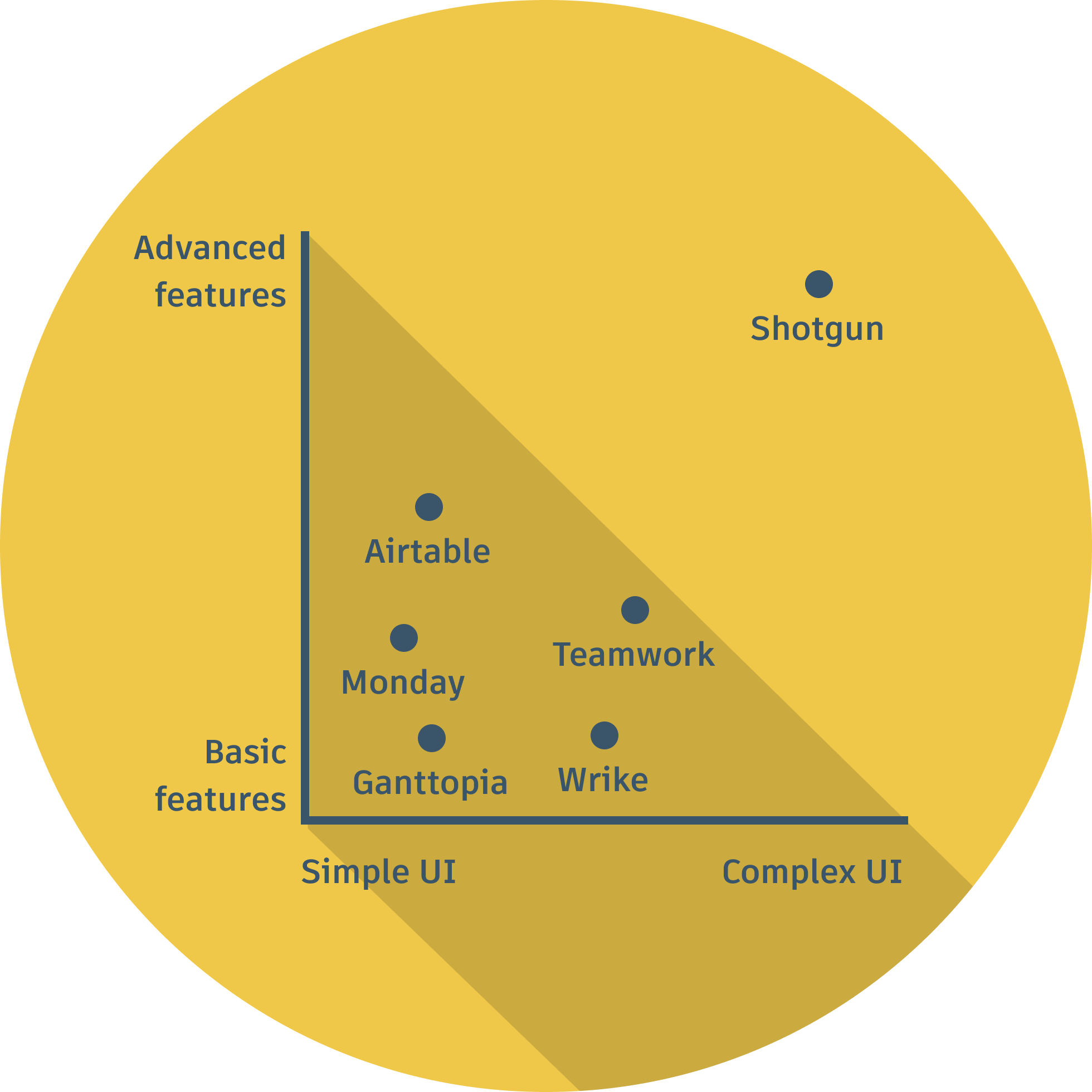
Despite much better UI and UX, none of our competitors were matching our features, which explained why our long term customers were often raving fans despite the pain experienced when using our interface.
Users turn towards Shotgrid when they need complex features to manage large projects.
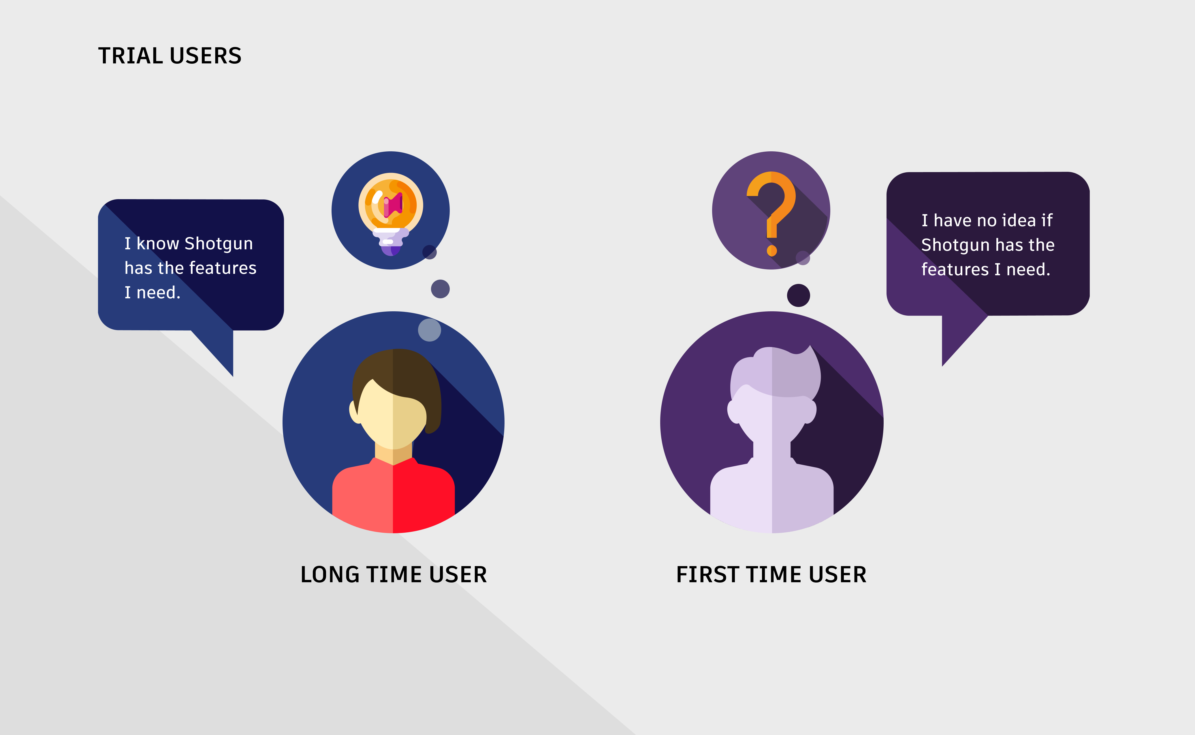
Why are some trial users converting and some aren’t?
Examining the profiles of our trial users, we realised that only users who had used Shotgrid before (at school or in a previous studio) or had received extra help from our support teams converted.
It wasn’t the lack of features that hindered Shotgrid, but the incapacity for customers to see whether these features existed and how they would work with their own processes.
This called for a radical simplification of of the mental model and interface so new users see the value of the software.
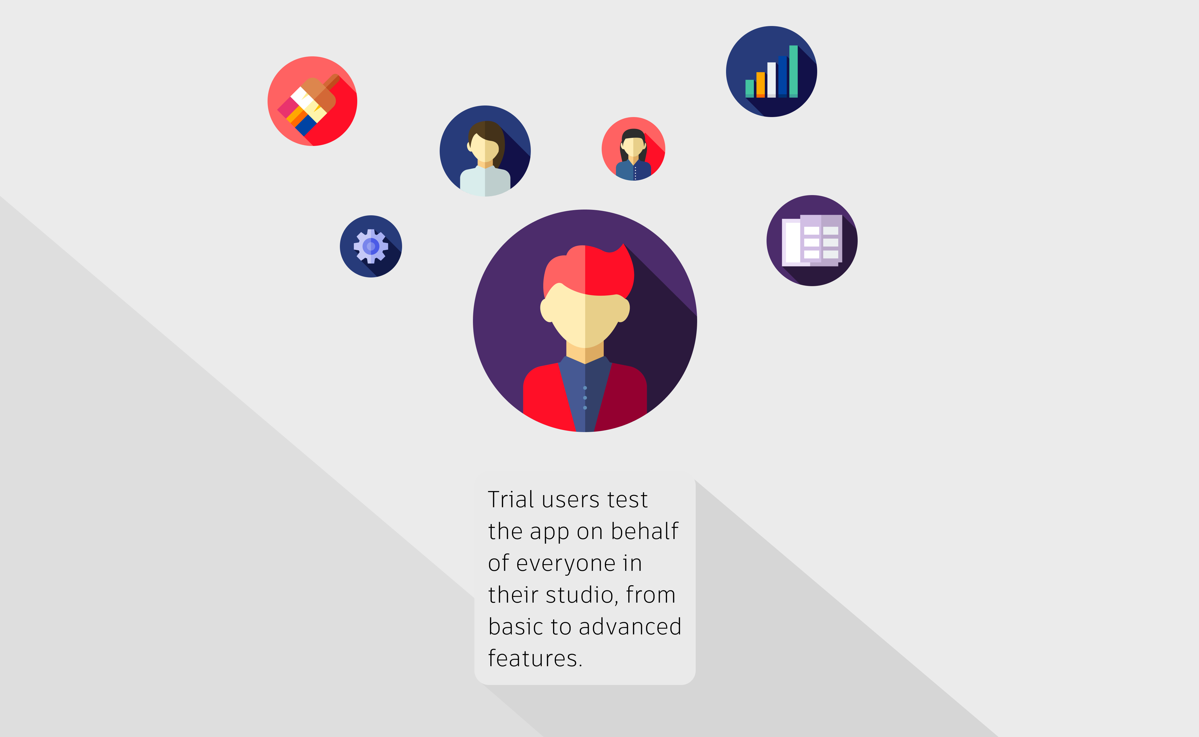
What are trial users trying to accomplish?
Looking more closely at our trial users, we realised that they gather requirements of everyone on the team, and in turn embody each of those roles to trial the app.
They test basic and advanced features alike, even when those will only be used by users several months after the software’s acquisition.
THE VISION: HOW DO WE REDESIGN?
Simple yet powerful
Based on our research, our vision for Shotgrid's redesign was to be clear and simple of use, yet powerful and flexible enough to support our prospective customers’ complex and often unique workflows.
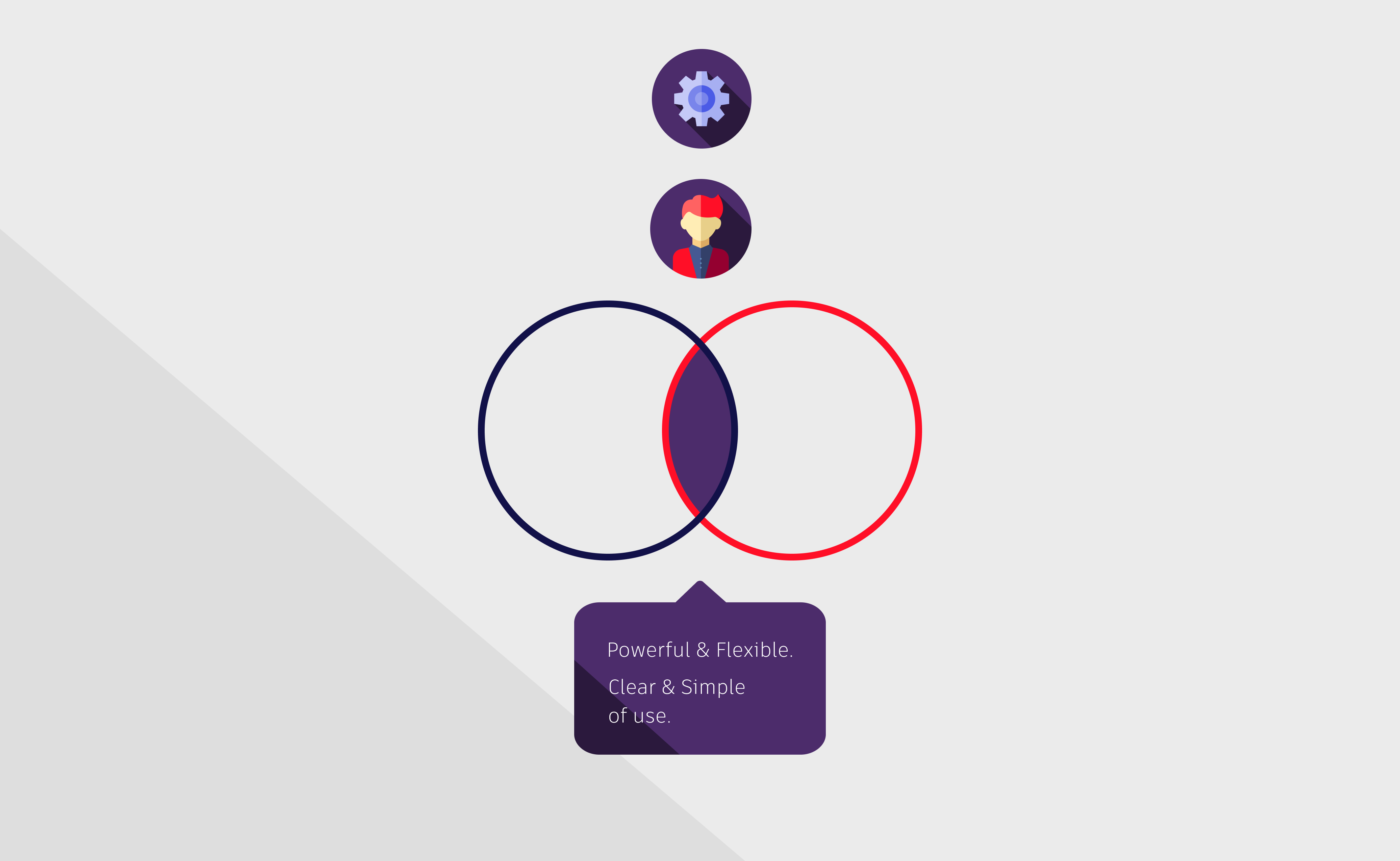
We were now persuaded that we didn’t need to build more features nor should we hide or get rid of them for simplicity sake; instead we had to help users understand more intuitively how to achieve their goals with our app, by redesigning the core flows our trial customers test on behalf of their studio, and by making sure we keep our trial user persona at the core of everything we design.
NEXT STEPS: WHAT DO WE REDESIGN?
Understand the jobs to be done
Based on our newly formed vision, we interviewed customers to discover what were the main jobs they were trying to accomplish when acquiring Shotgrid. We discovered two main jobs, that we further explored and broke down into hundred of more granular scenarios.
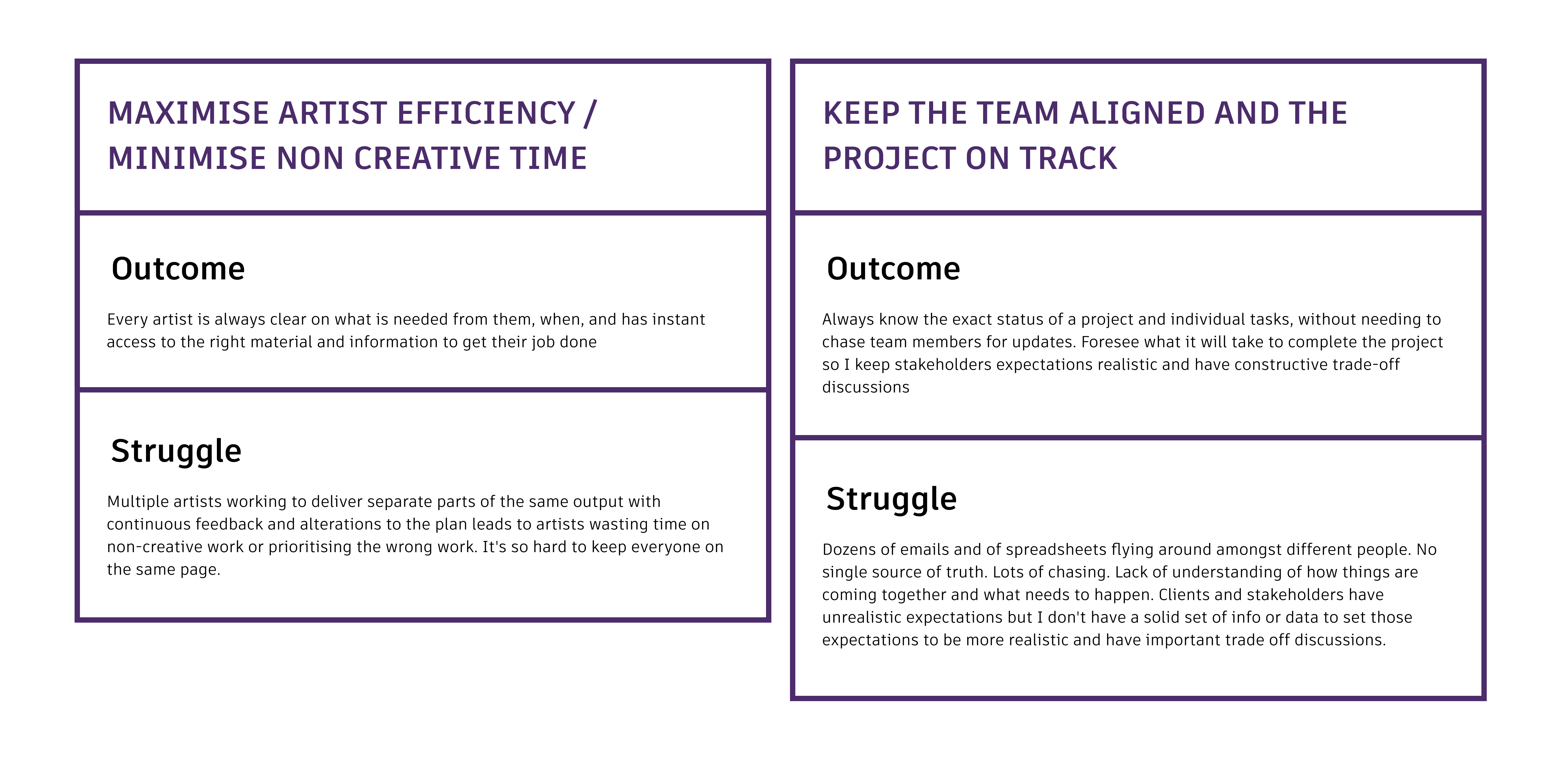
Planning the work
These Jobs to Be Done became the start of multiple projects across the app.