Autodesk · IA & patterns
-Global design patterns, in-app screens and prototype in code.
Client /Autodesk
Product /Shotgrid
Role /Product Design, UX Design, Prototyping in code, User testing
Originally tasked with redesigning Shotgrid’s smallest and most widely used element, I quickly realised that they were in fact the perfect test case for the larger redesign of elements’ behaviours across the app. This led me to create design principles to be used across the app, and to redesign the way templating and element propagation works across Shotgun, as well as designing user flows and in-app screens.
THE BACKGROUND
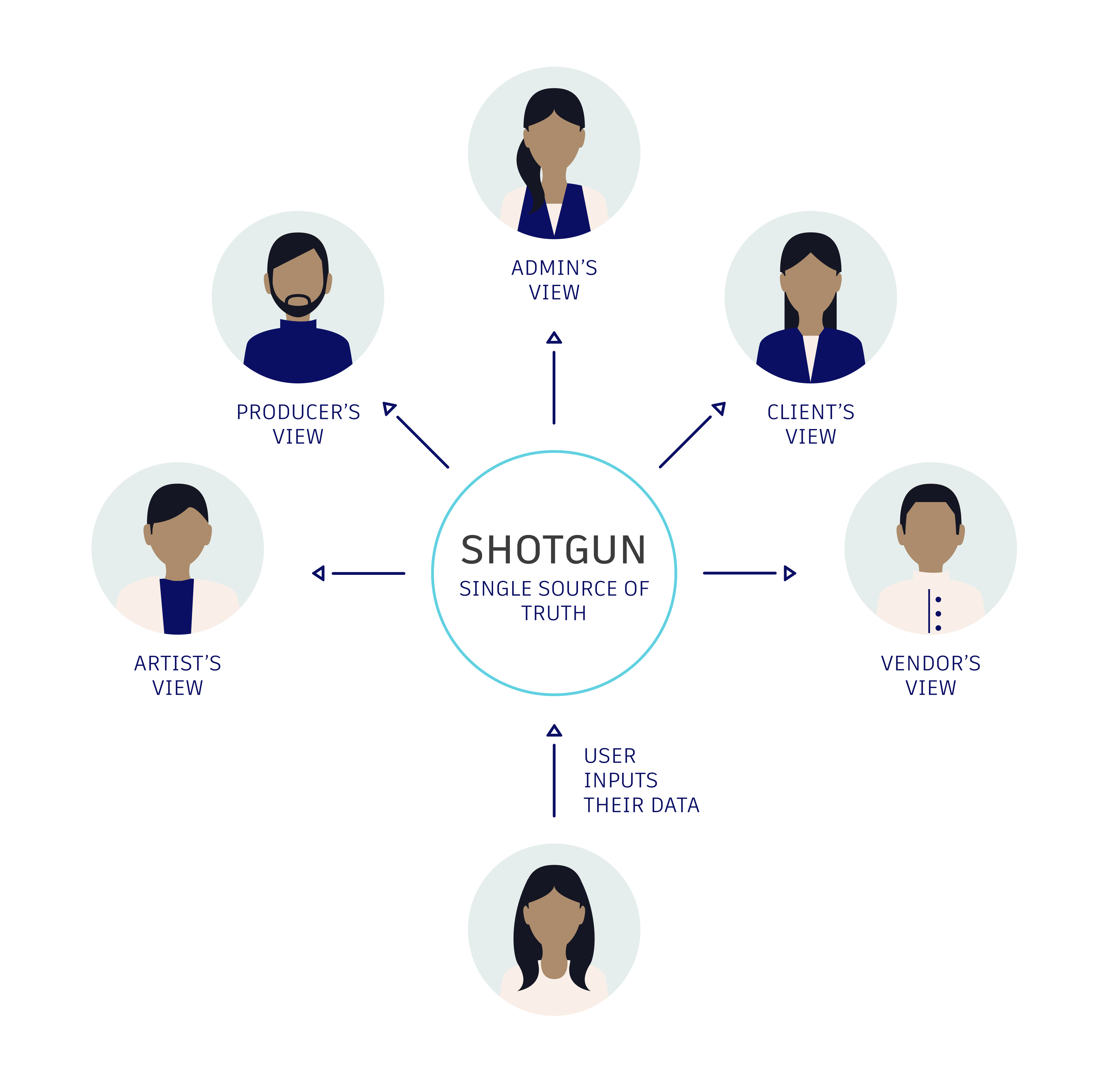
Shotgrid USP: single source of truth
Users choose Shotgrid over other products such as Google Sheets, because it acts as a single source of truth for their data.
THE INITIAL GOAL
Clarify field creation, retrieval and propagation
Single source of truth relies on one essential action: inputing user data in the correct “fields” in the software.
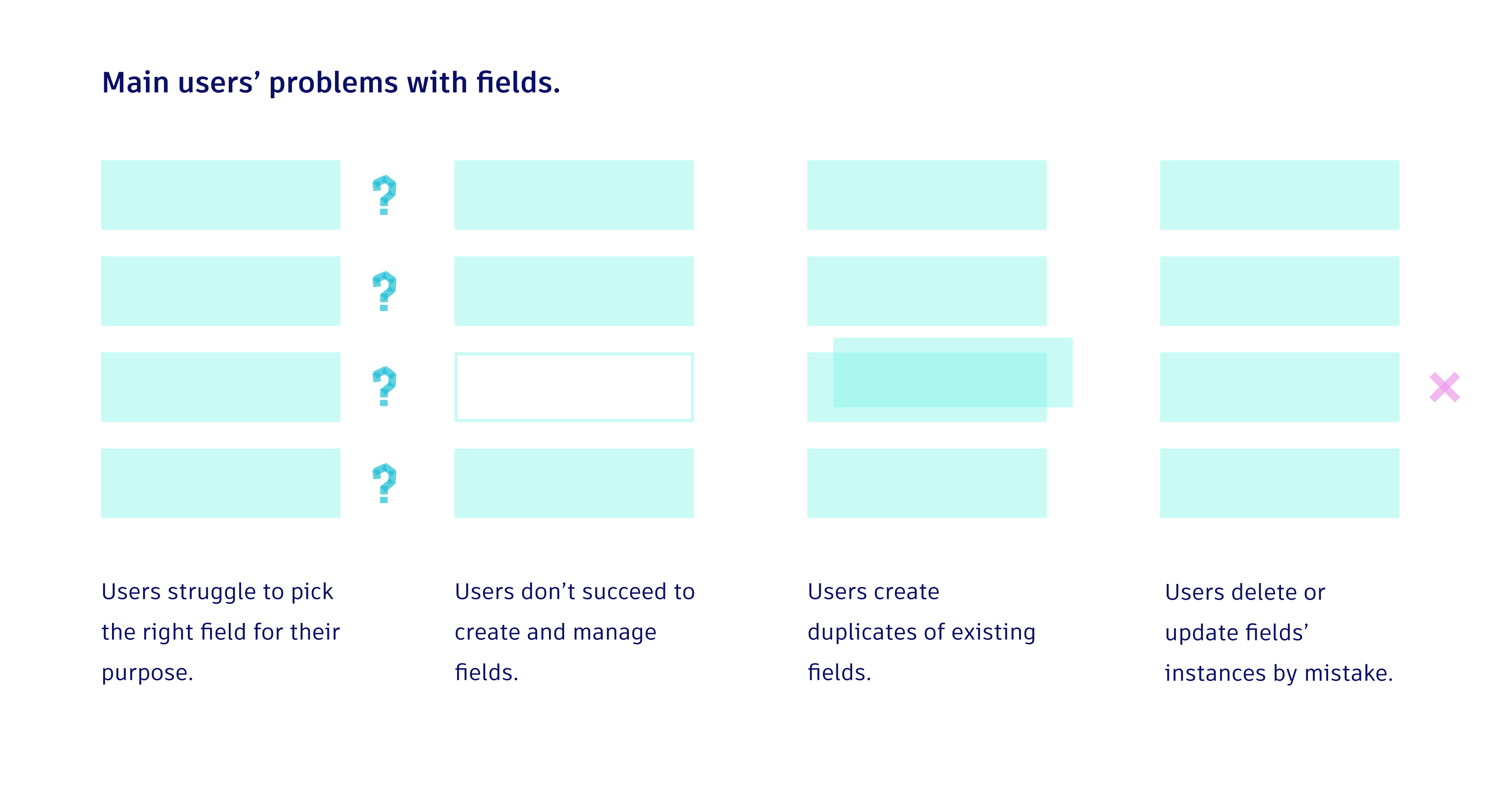
Observing and interviewing users, we realised that they found extremely difficult to work with fields, slowing down their work, endangering the integrity of their data and preventing automations and data analysis.
Our goal: To clarify the way fields work, so that users always know where to input their data.
WIDENING THE PROBLEM SPACE
Designing at scale
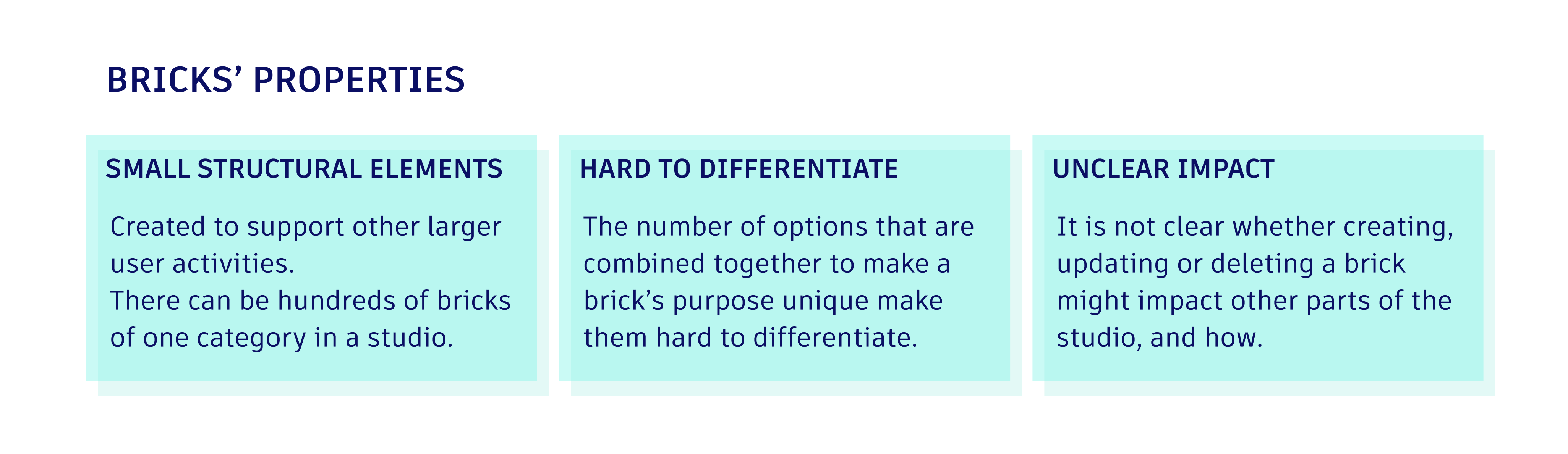
While examining fields, I realised that they had similar properties as several other types of elements, which I called “bricks”, in Shotgrid. Rather than designing in isolation, I decided to treat fields as a test case for a larger redesign of these elements’ behaviours across the app.
THE SOLUTION
Design principles and their practical application
I established three Design Principles; Separation of Concerns, Contextual Offload, Uninterrupted Flows. Each of these principles was designed with the practical problems encountered by fields’ users, while being extendable to other elements behaving similarly in the app.
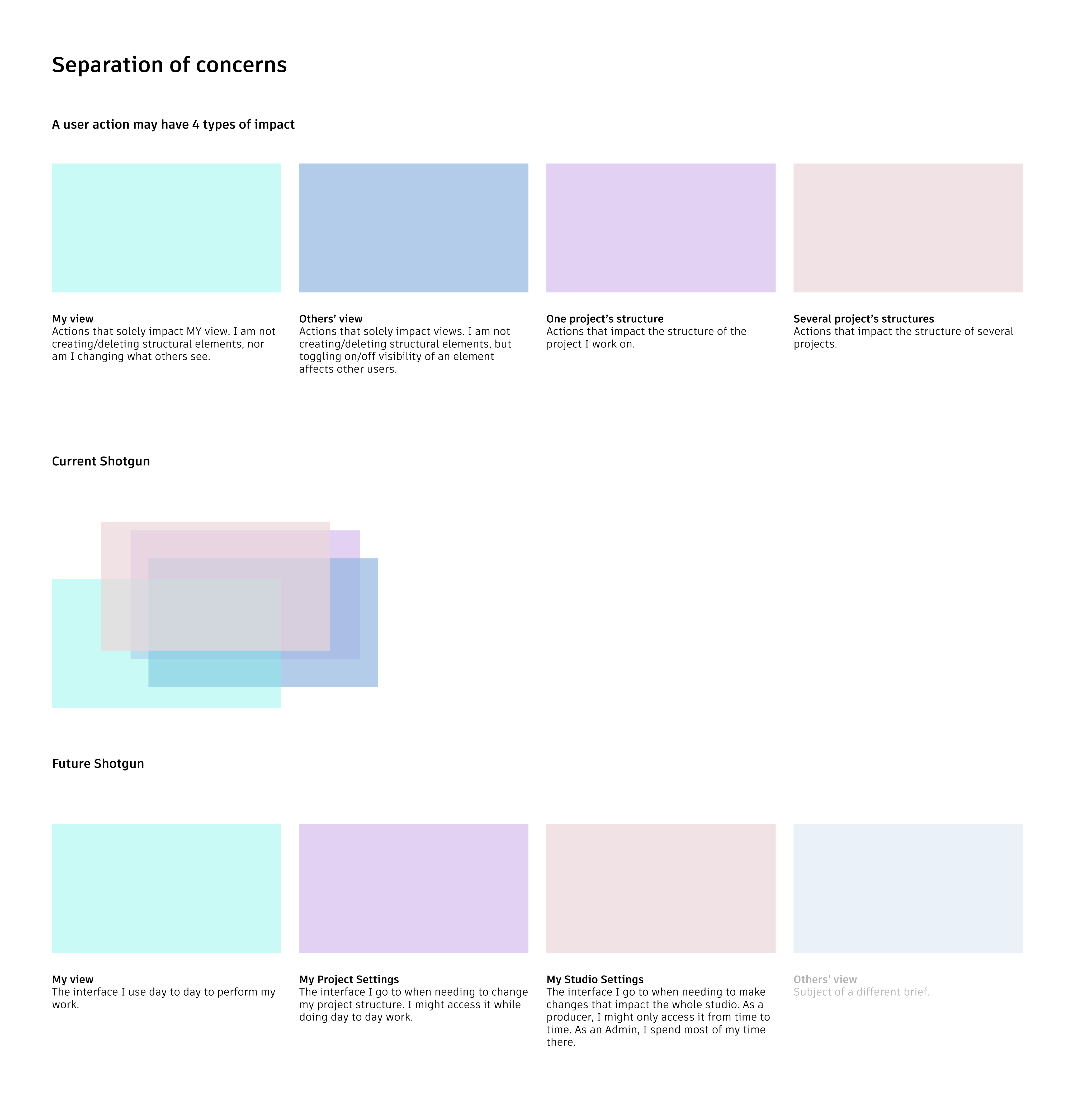
Separation of concerns
THE PROBLEM
The interface is a labyrinth. The various actions necessary to manage elements are scattered through the app without apparent coherence, proving extremely difficult to find. In addition, it is unclear what is the reach of an action; while some actions only impact the user, others touch everyone on their team or the whole studio.
IN PRACTICE
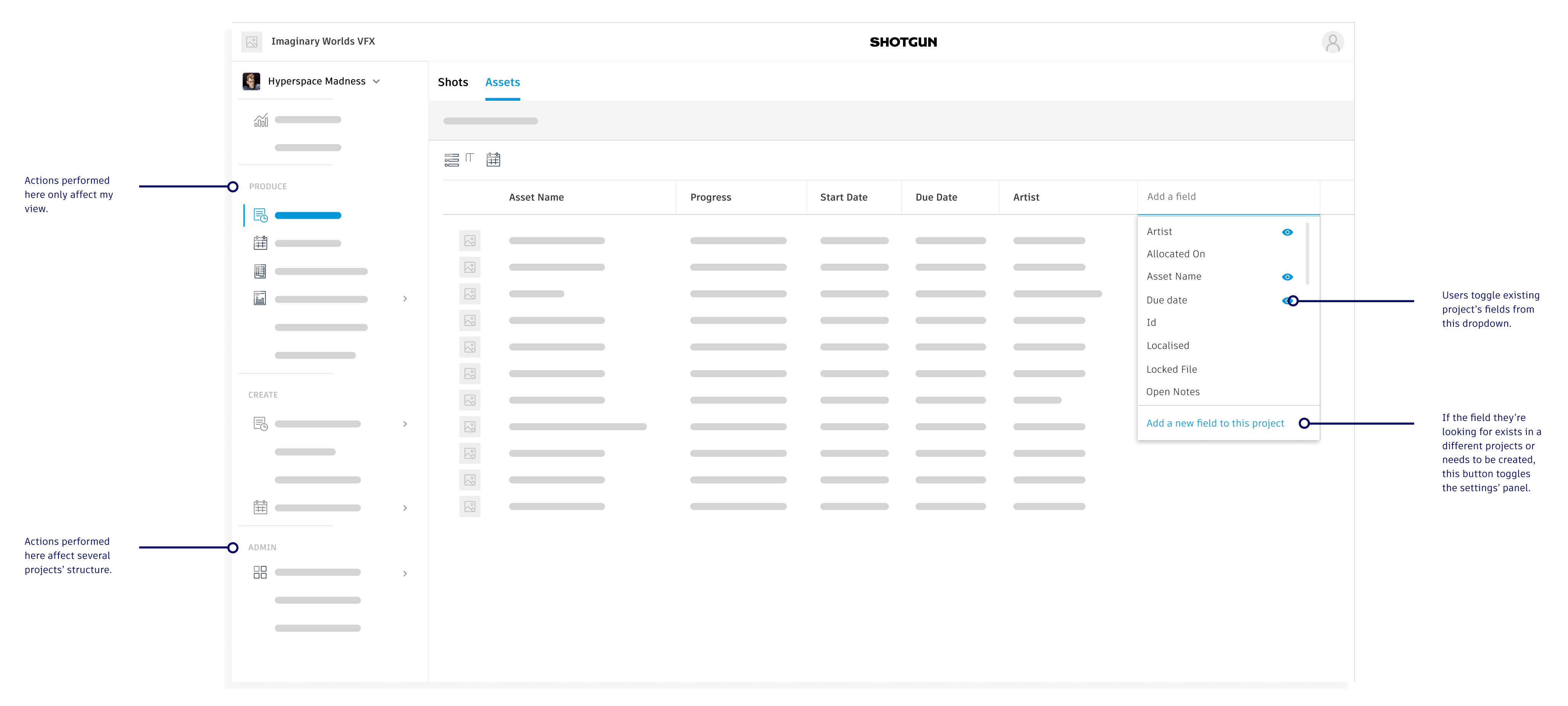
We gathered actions with the same type of impact under the same area of the app.
We also brought the concept of “my view” to life; now users can change the layout of their app without risking to carelessly impact other users’ view.
THE PRINCIPLE
A user action may have 4 types of impact.
Make instantly understandable to a user what is the reach of their actions + clarify where to go to be able to perform an action with a known reach, by separating concerns in the interface.
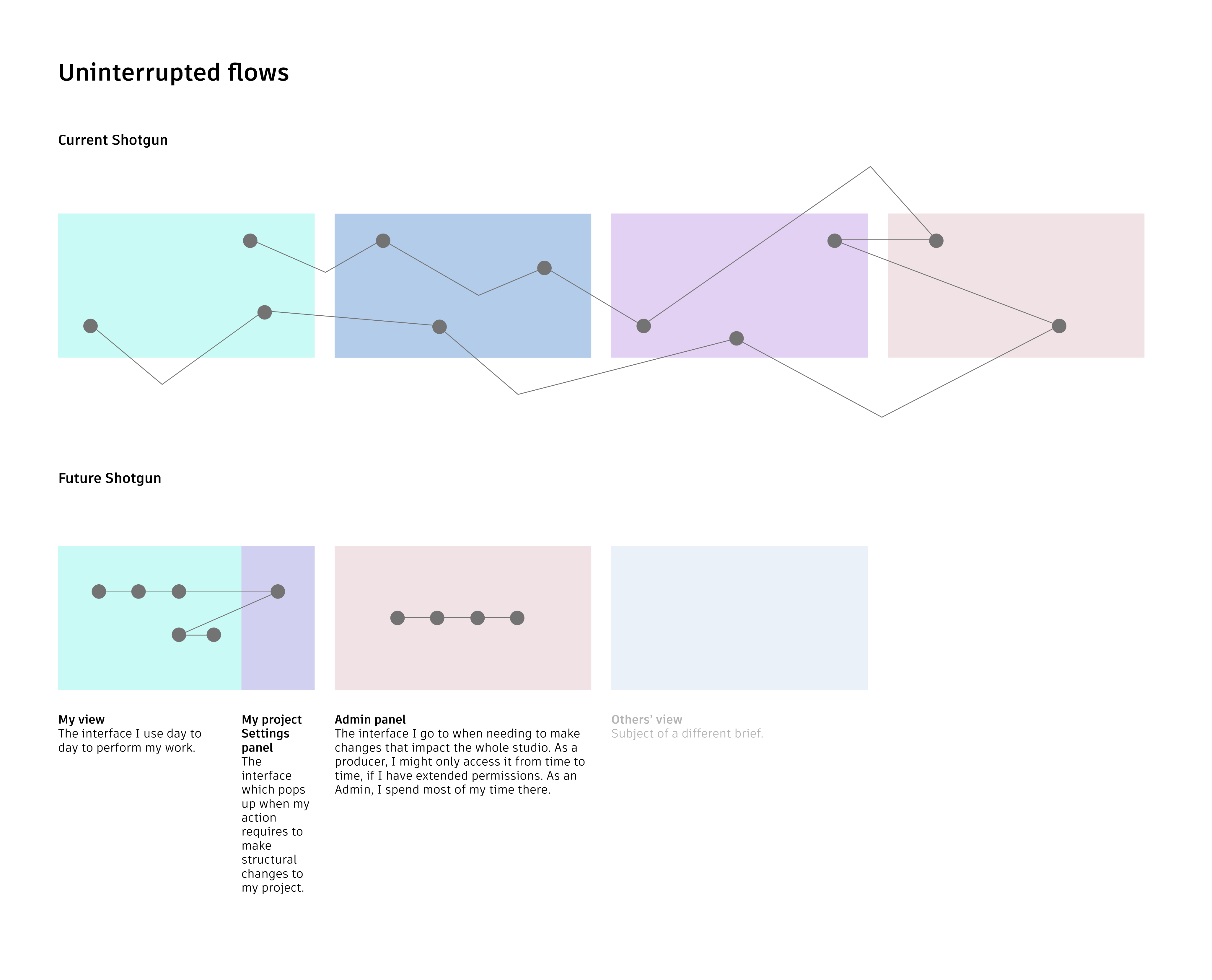
Uninterrupted Flows
THE PROBLEM
Using Separation of Concerns on its own would disturb users’ flows by forcing them to navigate through three different pages to complete certain flows.
THE PRINCIPLE
Keep users focused on the task at hand by bringing the tools they need where they need them.
IN PRACTICE
We kept separate areas related to different types of impact, but brought these separate areas on the same page. While the “studio settings” stay separate because they are usually accessed by admins or high power users only and that entire flows can live there, actions linked to “project settings” are now brought in “my view” through a side panel.
Element propagation: inter-projects and templating
THE PROBLEM
By limiting fields to the project they are created on, we were at risk to reinforce an existing problem:
Users would have to recreate fields in their own project, despite those already existing in a different project.
This is a problem large studios already encounter today on a massive scale, as users don’t even realise that a specific field exists on their project and recreate it anyway.
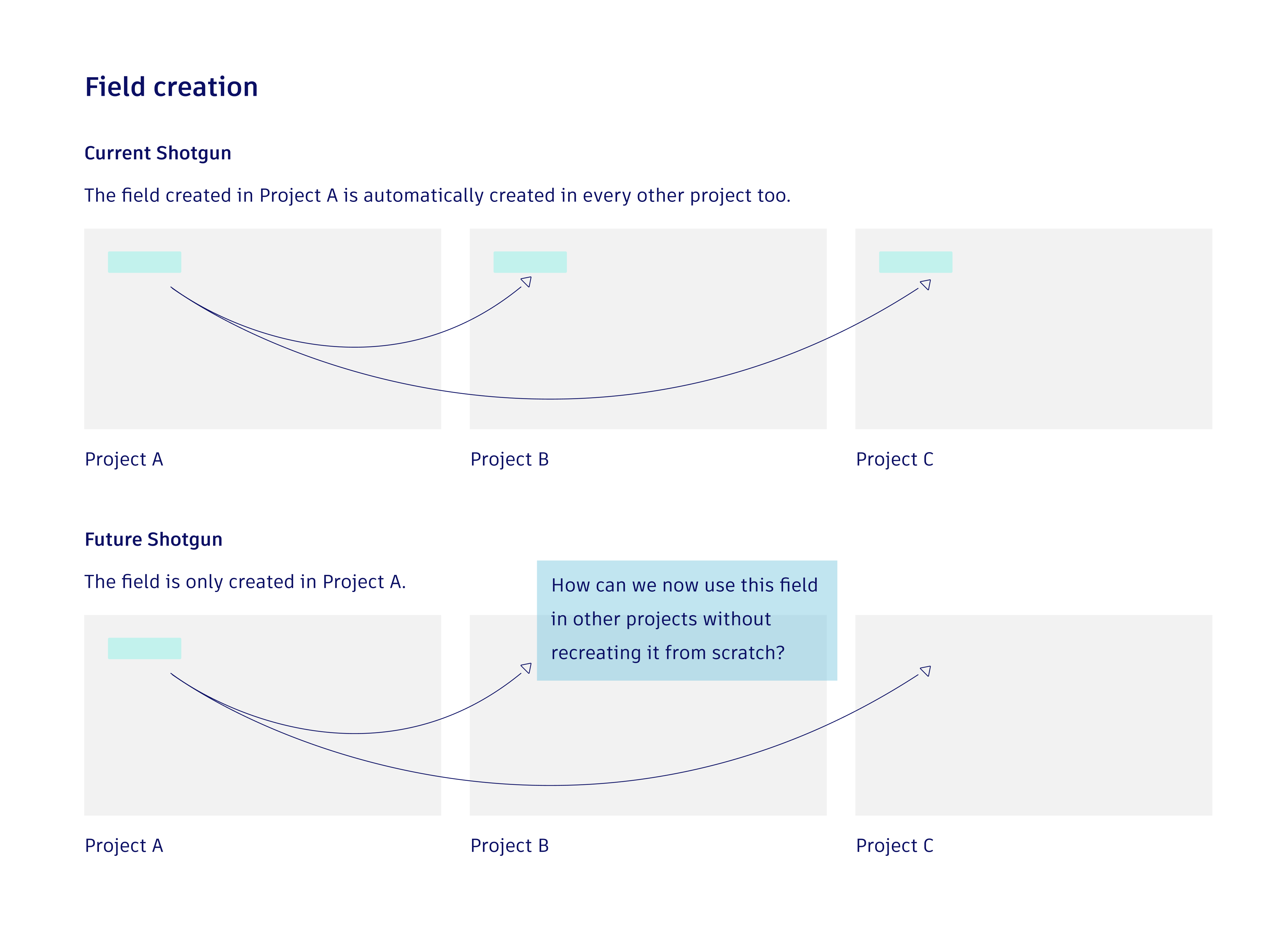
THE RESEARCH
To solve this problem, we had to find a way to easily propagate elements across projects.
We started by observing our users, and realised that we were facing 3 types of users, which could be divided in two categories.
THE PROBLEM
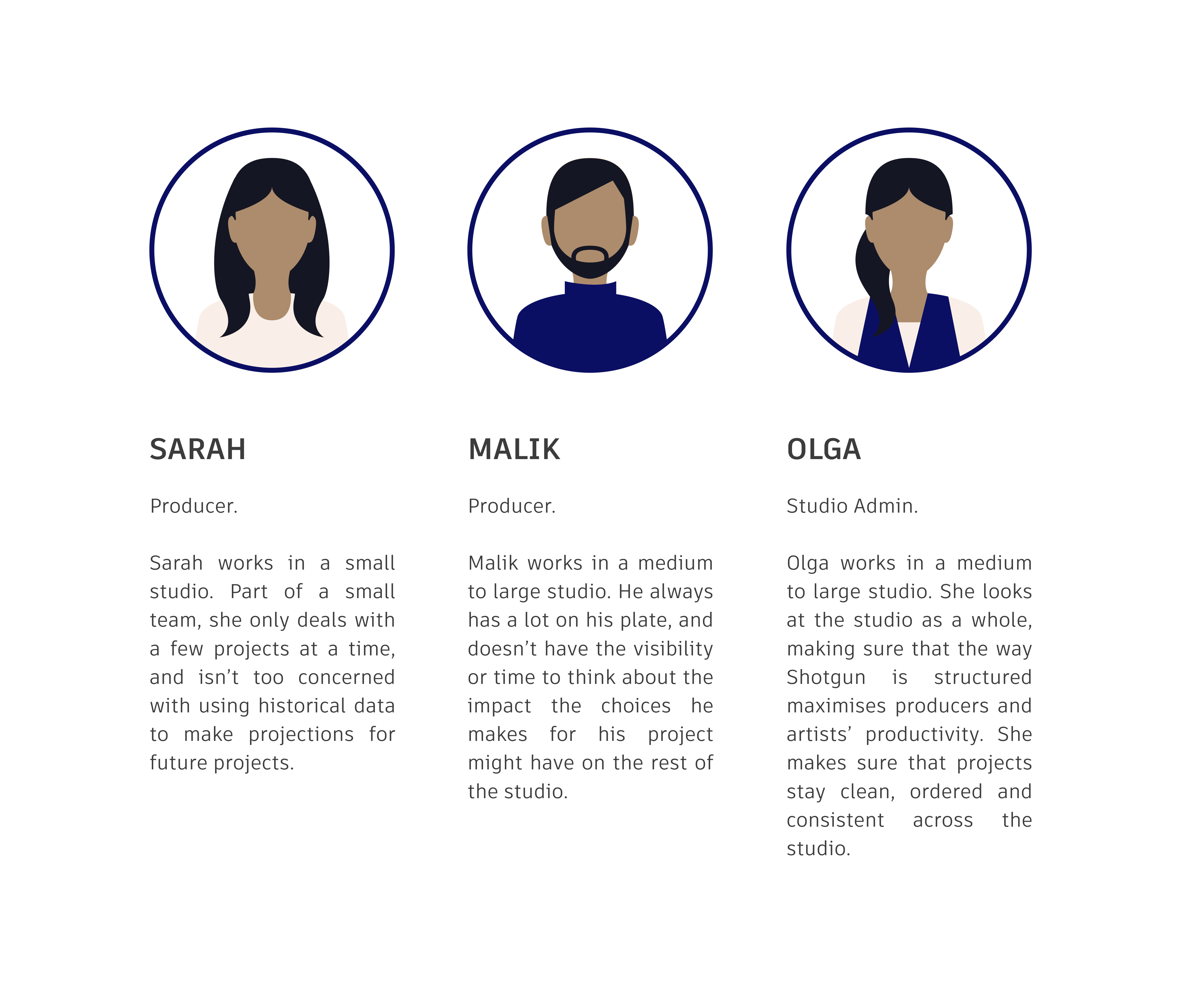
1. Users who are only preoccupied by what is happening in their current project context, and whose main goal is to work at speed.
Whether because they are new to Shotgrid and don’t yet understand how using elements throughout the studio could be of great benefit later on (Sarah), or because they just don’t have the time or the visibility to think about how their actions might impact other parts of the studio (Malik).
2. Users who are looking at the studio as a whole, and whose main goal is to keep projects clean and easily maintainable.
This usually occurs once a studio manages multiple complex projects at once. (Olga) (Or Sarah once her studio has grown).
THE SOLUTION
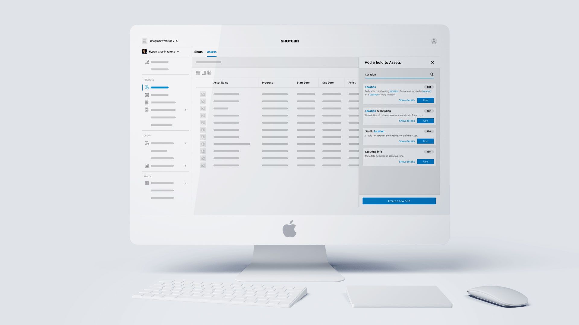
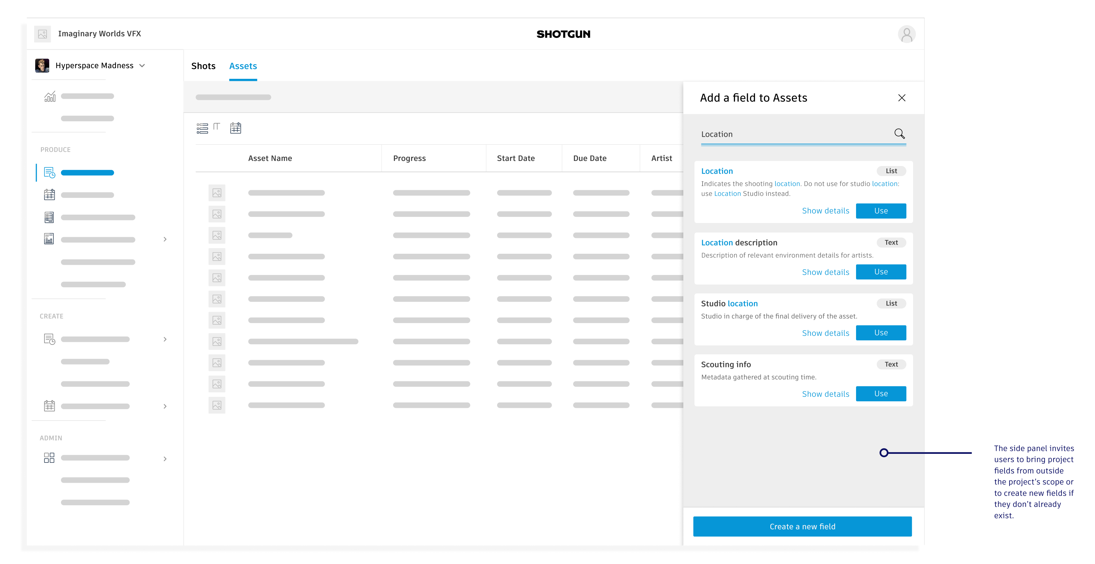
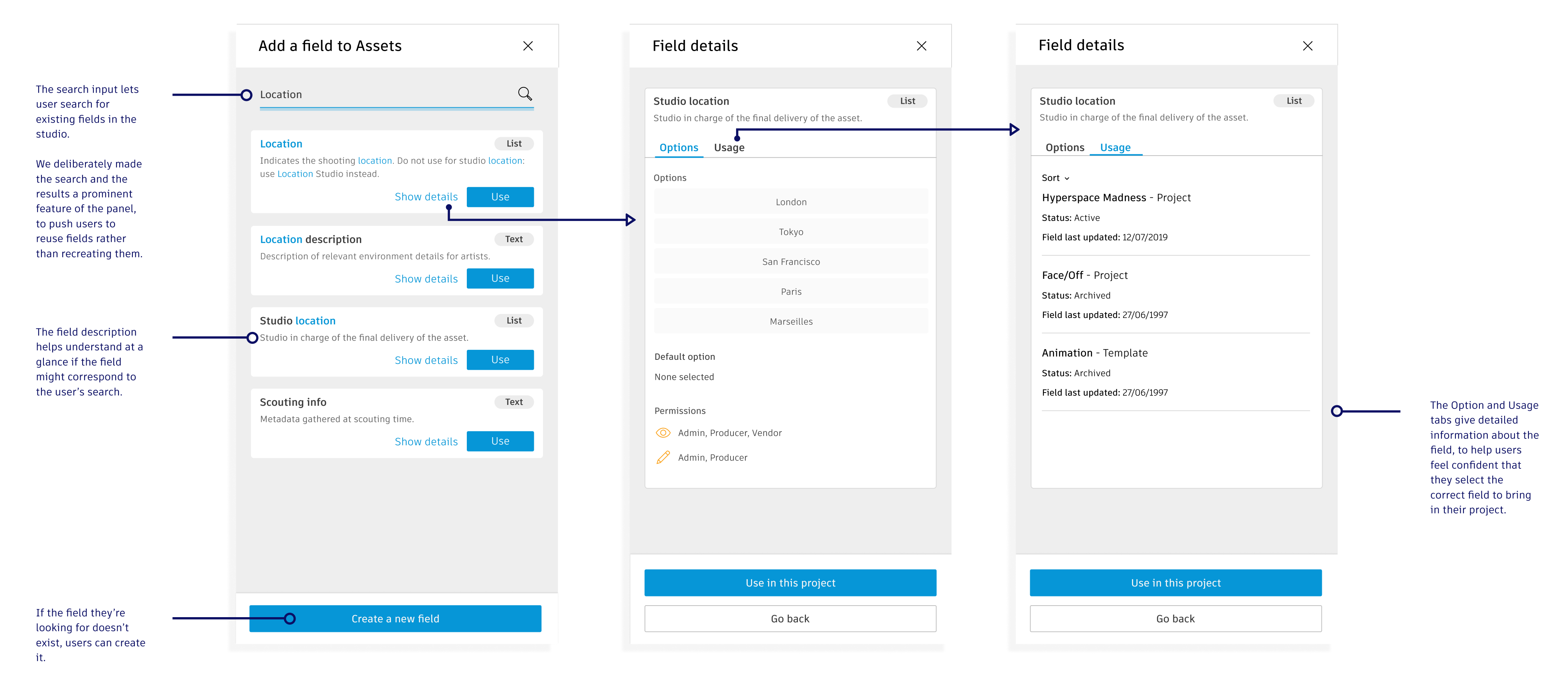
1. Field picker: For users who need to work on a project at speed.
The field picker helps users identify fields existing in other projects, to bring in their own project to use.
With the field picker, we guarantee Sarah and Malik a quick way to reuse fields, without having to know anything about other projects in the studio.
This also helps our second category of users, as this makes sure that a new fields won’t be created if an existing one already does its job.
2. Template upgrade and admin dashboard : for users who need to work across the studio.
Users who work across the studio need to dispatch, update and delete fields across numerous existing and future projects.
So we gave users visibility on how a field is shared between projects, and what impact updating or deleting it would have on those projects.
We also gave them easy ways to add or delete fields to current and future projects. This reintroduced Templates as a useful tool in the admin’s toolbox, as up to that point, users barely used them due to this lack of visibility and difficulty to update.
Admin also need to monitor fields created by other users, along with tools to regulate them if done incorrectly.
So we created an admin dashboard to track the creation and update of fields across the studio. We also created new tools to merge or split fields that might have been wrongly created or used.
WORKING IN AN EXISTING SOFTWARE
Focusing on the Importer first
Working in an existing software brings its lot of challenges. In our case, our users spend hours every day using Shotgrid, and any change might impact their capacity to deliver the media they are making.
Therefore it is critical to think strategically about the areas of the app we are tackling first, and how to release these changes to them.
In that context, before changing the way fields work at the app level, we decided to focus our efforts on a specific part of the app; the Importer, which is a series of screens through which users import their spreadsheet into Shotgrid. This helped us test our new field design in an enclosed context, while simplifying an entry point which often throws off trial users.
We explored different directions with paper prototypes, then digital ones, and finally a fully interactive prototype that I coded. We used this last prototype for multiple user tests, each test helping us refine the final version of the design.
Finally we worked with developers to prioritise the areas of design to be coded.